How can I make the application suitable for iPhone and iPad ? because when I tried it on ipad all buttons and images looked ugly.
Can you please provide some more information (such as screenshots for illustration) to clarify the problem?
I want to submit one version of the app but when the user upload it on iPhone or iPad it should be suitable for both.
You can create different layouts and designs for different form factors by using viewport triggers.
However, if there’s something that looks wrong or ugly then we need more information to be able to fix it.
.
How can I know the window size for devices ? what should I change in my case?
Hi!
Could you show us some of you UX? I assume you are using absolute values for the Width and Height of you images?
In that case, you should consider switching to using relative values instead. For elements you can set their Width and Height to a percentage of their parent size. So if you want each of you bottom images to be 1/3 of their parent width you can set their Width="33%".
Let me know if this was not what you were looking for.
Edit:
You should also look into MultiDensityImageSource when creating apps for multiple screen densities. https://www.fusetools.com/learn/fuse#multidensityimagesource
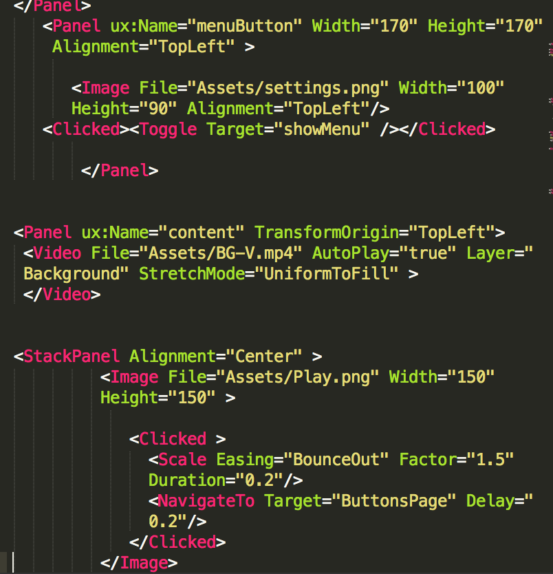
How about video?
I don’t think we have a similar thing for Video but of course you can also set the Width and Height using percentage on Video as well.
Did you try any of my suggestions?
Btw: When posting in the forum you can write regular markdown instead of screenshots of your code:
Here is a nice overview of how markdown works if you are not familiar: https://daringfireball.net/projects/markdown/syntax