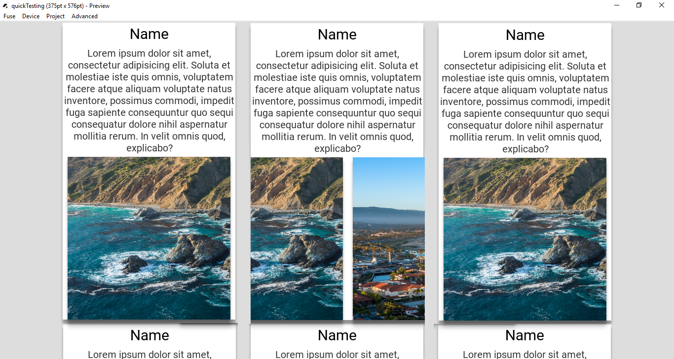
So in this app where feed is just an observable with a bunch of objects (not releavant):
<App Theme="Basic" Background="#DDD">
    <JavaScript File="MainView.js" />
    <DockPanel>
        <ScrollView ux:Name="feed">
            <StackPanel Alignment="TopCenter">
                <ColumnLayout ColumnSize="380" />
                <Each Items="{feed}">
                    <StackPanel Background="#fff" Margin="15,4">
                        <DropShadow Distance="8" />
                        <Text Alignment="Center" Value="Name" Padding="0,5" FontSize="30" TextAlignment="Center" TextWrapping="Wrap" />
                        <Text Alignment="Center" Padding="0,5" FontSize="20" TextColor="#333" TextAlignment="Center" TextWrapping="Wrap" Value="Lorem ipsum dolor sit amet, consectetur adipisicing elit. Soluta et molestiae iste quis omnis, voluptatem facere atque aliquam voluptate natus inventore, possimus commodi, impedit fuga sapiente consequuntur quo sequi consequatur dolore nihil aspernatur mollitia rerum. In velit omnis quod, explicabo?" />
                        <PageControl>
                            <DropShadow Distance="8" />
                            <Image File="Assets/background1.png" BoxSizing="FillAspect" StretchMode="Fill" Margin="10,0" />
                            <Image File="Assets/background2.png" BoxSizing="FillAspect" StretchMode="Fill" Margin="10,0" />
                            <Image File="Assets/background3.png" BoxSizing="FillAspect" StretchMode="Fill" Margin="10,0" />
                        </PageControl>
                    </StackPanel>
                </Each>
            </StackPanel>
        </ScrollView>
    </DockPanel>
</App>
Looking at this photo you can see the image as I swipe is on top of the white <StackPanel>:
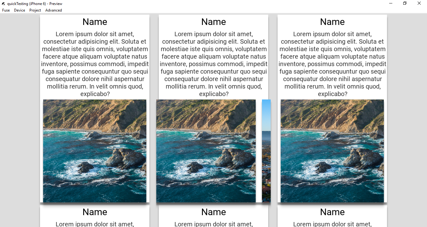
How do I get the <Image> to seem as if its coming out of the white <StackPanel> like so, in the following edited image:
Excuse my mspaint skills  but as you can see the middle card that effect is what I want, where when I’m sliding the Images they are behind the white StackPanel


