Making a Container

Hi,
I’m trying to design a pop-up class, as in something is tapped, and then a list pops up from the bottom. Similar to the regular iOS menu, here’s an example:

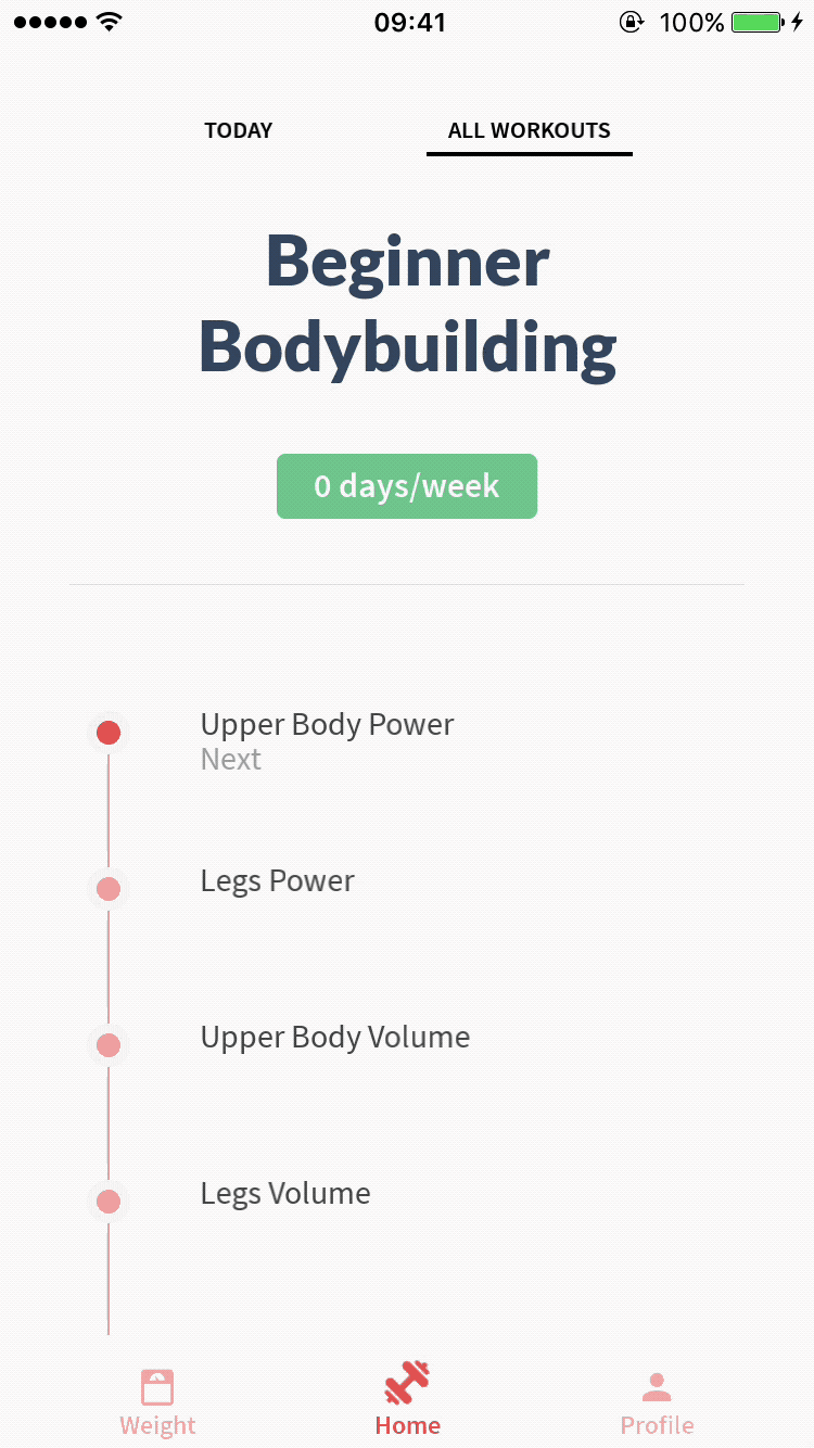
When the green button is tapped a menu appears. I want to class with an empty menu, where I can set the title, and the description. It should also be a container, so I can fill the stack panel with any items I want.

Here’s my attempt, it’s not great:

<Container ux:Class="OptionsPanel" Subtree="innerPanel" HitTestMode="LocalBoundsAndChildren" Title="Title" Description="Description" Open="false">
	<bool ux:Property="Open" />
	<string ux:Property="Title" />
	<string ux:Property="Description" />
	<WhileTrue Value="{Property this.Open}">
		<Set OptionsControlPanel.Active="main" />
	</WhileTrue>
	<WhileFalse Value="{Property this.Open}">
		<Set OptionsControlPanel.Active="away" />
	</WhileFalse>
	<PageControl ux:Binding="Children" ux:Name="OptionsControlPanel" Orientation="Vertical" Active="away">
		<Page ux:Binding="Children" ux:Name="main" Margin="8" Alignment="Bottom">
			<ActivatingAnimation>
				<Change backRect.Opacity="0.5" Duration="0.3" Delay="0.3" />
			</ActivatingAnimation>
			<DockPanel ux:Binding="Children">
				<StackPanel Dock="Top" Padding="32, 32, 32, 0">
					<Text Value="{Property this.Title}" Font="Subtitle" FontSize="15" Color="{Resource DarkBlue}" />
					<Text Value="{Property this.Description}" Font="Regular" FontSize="15" Opacity="0.6" TextWrapping="Wrap" />
					<Rectangle Height="1" Color="#000" Opacity="0.1" Margin="0, 8, 0, 0" />
				</StackPanel>
				<ScrollView ux:Binding="Children" SnapMinTransform="false">
					<StackPanel ux:Name="innerPanel">
						
					</StackPanel>
				</ScrollView>
				<Panel ux:Binding="Children" Dock="Bottom" Height="52">
					<Text Width="52" Alignment="Center" TextAlignment="Center" TextColor="#FFF" Value="&#xF12C;" Font="MaterialIcon" FontSize="24" />
					<Rectangle CornerRadius="0, 0, 4, 4" Color="{Resource Highlight}" Opacity="0.5" />
					<Clicked>
						<Callback Handler="{save}" />
					</Clicked>
				</Panel>
			</DockPanel>
			<Rectangle CornerRadius="4" Color="#FFF" />
		</Page>
		<Page>
			<WhileActive>
				<Change this.HitTestMode="None" />
			</WhileActive>
		</Page>
	</PageControl>
	<Rectangle ux:Name="backRect" Color="#000" Opacity="0" />
</Container>

Here’s a fully working example with terrible colours:

<App>
	
	<Panel ux:Name="DaysPanel" HitTestMode="LocalBoundsAndChildren">
		<PageControl ux:Name="DaysPanelControl" Orientation="Vertical" Active="away">
			<Page ux:Name="away">
				<WhileActive>
					<Change DaysPanel.HitTestMode="None" />
				</WhileActive>
			</Page>
			<Page ux:Name="main" Margin="8" Alignment="Bottom">
				<ActivatingAnimation>
					<Change backRect.Opacity="0.5" Duration="0.3" Delay="0.3" />
				</ActivatingAnimation>
				<DockPanel>
					<StackPanel Dock="Top" Padding="32, 32, 32, 0">
						<Text Value="Workout Days" FontSize="15" Color="#00f" />
						<Text Value="Your workouts will cycle through your selected days." FontSize="15" Opacity="0.6" TextWrapping="Wrap" />
						<Rectangle Height="1" Color="#000" Opacity="0.1" Margin="0, 8, 0, 0" />
					</StackPanel>
					<ScrollView SnapMinTransform="false">
						<StackPanel>
							<Each Count="7">
								<Panel HitTestMode="LocalBoundsAndChildren" Height="52" Padding="32, 0, 32, 0" >
									<Text Value="Test" Opacity="0.8" Alignment="CenterLeft" />
								</Panel>
							</Each>
						</StackPanel>
					</ScrollView>
					<Panel Dock="Bottom" Height="52">
						<Text Width="52" Alignment="Center" TextAlignment="Center" TextColor="#FFF" Value="&#xF12C;" FontSize="24" />
						<Rectangle CornerRadius="0, 0, 4, 4" Color="#0f0" Opacity="0.5" />
						<Clicked>
							<Set DaysPanelControl.Active="away" />
						</Clicked>
					</Panel>
				</DockPanel>
				<Rectangle CornerRadius="4" Color="#FFF" />
			</Page>
		</PageControl>
		<Rectangle ux:Name="backRect" Color="#000" Opacity="0" >
			<Clicked>
				<Set DaysPanelControl.Active="away" />
			</Clicked>
		</Rectangle>
	</Panel>
	<Button Text="Click me" Alignment="Center">
		<Clicked>
			<Set DaysPanelControl.Active="main" />
		</Clicked>
	</Button>
</App>

Essentially this is a vertical PageControl with the entire panel being placed on a very high level in the page. When the main page isn’t active then it has no hitbox. Also, I want to be able to choose the “done” function, in my attempt I leave it at {save} because I’m not sure how to do this. I feel like I’ve approached this all the wrong way, any advice would be great!

Cheers

The designer of the app I am developing came with a solution for something similar of that you want to do. For us this is just a picker in a list but this can be changed to suit your needs.

<Panel>
   <!-- ComboBox Button -->
   <Panel ux:Class="ComboBoxBtn" HitTestMode="LocalBounds">
      <bool ux:Property="HasValue"/>
      <string ux:Property="Placeholder"/>

      <DockPanel Offset="0,8">
         <Each Count="1" TemplateSource="this" TemplateKey="Option">
            <DockPanel Padding="15,0,15,20">
               <Icon Value="&#xE5CF;" FontSize="20" Color="color2" Dock="Right" Alignment="Bottom"/>
               <Medium ux:Name="label" Value="{Property this.Placeholder}" FontSize="14" TextColor="gray2" Alignment="Bottom" TextAlignment="Left" Dock="Fill" />
               <WhileTrue Value="{Property this.HasValue}">
                  <Change label.Color="color2" />
               </WhileTrue>
            </DockPanel>
         </Each>
      </DockPanel>
      <WhilePressed>
         <Change this.Color="#eee"/>
      </WhilePressed>
      <!-- <Rectangle Color="color2" Height="1" Alignment="Bottom"/> -->
   </Panel>

   <!-- ComboBox -->
   <Panel ux:Class="ComboBox">
      <object ux:Property="Options"/>
      <object ux:Property="Selected"/>
      <bool ux:Property="IsOpen"/>

      <JavaScript>
        var Observable = require ("FuseJS/Observable");

        var self = this;
        var options = self.Options.inner();

        module.exports = {
           options : options.map(function(option){
              return {
                 title : option.name,
                 value : option.val,
                 isSelected : Observable(function() { return self.Selected.value.value.val == option.val; }),
                 clicked : function () {
                   if (self.Selected.value instanceof Observable) {
                     self.Selected.value.value = option;
                   }
                 }
              }
           })
        }
      </JavaScript>

      <!-- Dropdown -->
      <StackPanel ux:Name="dropdown" Padding="12" Color="gray1" >
        <IconButton.Action Icon="{icons.close}" IconColor="gray2" IconSize="26" Alignment="TopRight">
          <Clicked>
             <Set this.IsOpen="false" />
          </Clicked>
        </IconButton.Action>
         <ScrollView>
            <StackPanel Width="90%">
               <Each Items="{options}">
                  <Panel ux:Name="item" Height="40" HitTestMode="LocalBounds">
                     <Medium ux:Name="title" Value="{title}" Color="gray2" TextAlignment="Center" Alignment="Center"/>
                     <WhileTrue Value="{isSelected}">
                       <Change title.Color="color2"/>
                     </WhileTrue>
                     <WhilePressed>
                        <Change item.Color="gray1b"/>
                     </WhilePressed>
                     <Clicked Handler="{clicked}" >
                        <Set this.IsOpen="false" />
                     </Clicked>
                     <!-- <Rectangle Color="white" Height="1" Alignment="Bottom"/> -->
                  </Panel>
               </Each>
            </StackPanel>
         </ScrollView>
         <WhileFalse Value="{Property this.IsOpen}">
            <Change dropdown.Opacity="0" Duration="0.2" Easing="CubicOut" />
            <Change dropdown.Visibility="Hidden" Delay="0.2" />
         </WhileFalse>
      </StackPanel>
   </Panel>
</Panel>

and this is how we call the class

<ComboBoxBtn HasValue="{hasCountry}" Placeholder="{selectedCountry.name}" >
	<Clicked>
			<Set Combobox.Options="{countryOptions}" />
			<Set Combobox.Selected="{selectedCountry}" />
			<Set Combobox.IsOpen="true" />
	</Clicked>

	<Rectangle Color="color2" Height="1" Alignment="Bottom"/>
</ComboBoxBtn>

in the JS

var hasCountry = Observable(false);
var countryOptions =Observable({name:"Country1", val: 1}, {name:"Country2", val: 2});
var selectedCountry = Observable({name : "Country", val :null});
selectedCountry.onValueChanged(module, function (sel) {
  if (sel.val != null)
    hasCountry.value = true;
});

Ours solution does not have a animation as yours example but I hope that this is what you were looking for. Sorry If I did not understand what you asked.

Thanks Wilton, great share, though this isn’t what I want.

Hi Fahad.

In this case i would just use a WhileTrue to show/hide the popup panel instead of a PageControl.
You can give it the proper animation using AddingAnimation and RemovingAnimation.

I’ve modified your example to use my suggested method. Let me know if there is something that needs explaining :):

<App>
	<Panel ux:Class="Popup">
		<bool ux:Property="Show"/>
		<WhileTrue ux:Name="showDaysPanel" Value="{Property Show}">
			<Panel ux:Name="DaysPanel" HitTestMode="LocalBoundsAndChildren" Color="White">

				<AddingAnimation>
					<Move Y="1" RelativeTo="Size" Duration="0.3" />
					<Change backRect.Opacity="0.5" Duration="0.3" Delay="0.3" />
				</AddingAnimation>
				<RemovingAnimation>
					<Move Y="1" RelativeTo="Size" Duration="0.3" />
					<Change backRect.Opacity="0.5" Duration="0.3" Delay="0.3" />
				</RemovingAnimation>
				<DockPanel>
					<StackPanel Dock="Top" Padding="32, 32, 32, 0">
						<Text Value="Workout Days" FontSize="15" Color="#00f" />
						<Text Value="Your workouts will cycle through your selected days." FontSize="15" Opacity="0.6" TextWrapping="Wrap" />
						<Rectangle Height="1" Color="#000" Opacity="0.1" Margin="0, 8, 0, 0" />
					</StackPanel>
					<ScrollView SnapMinTransform="false">
						<StackPanel>
							<Each Count="7">
								<Panel HitTestMode="LocalBoundsAndChildren" Height="52" Padding="32, 0, 32, 0" >
									<Text Value="Test" Opacity="0.8" Alignment="CenterLeft" />
								</Panel>
							</Each>
						</StackPanel>
					</ScrollView>
					<Panel Dock="Bottom" Height="52">
						<Text Width="52" Alignment="Center" TextAlignment="Center" TextColor="#FFF" Value="&#xF12C;" FontSize="24" />
						<Rectangle CornerRadius="0, 0, 4, 4" Color="#0f0" Opacity="0.5" />
						<Clicked>
							<Toggle Target="showDaysPanel"/>
						</Clicked>
					</Panel>
				</DockPanel>

				
				<Rectangle ux:Name="backRect" Color="#000" Opacity="0" >
					<Clicked>
						<Toggle Target="showDaysPanel"/>
					</Clicked>
				</Rectangle>
			</Panel>
		</WhileTrue>
	</Panel>
	<Popup ux:Name="popup"/>
    <Button Text="Click me" Alignment="Center">
        <Clicked>
			<Set popup.Show="true" />
        </Clicked>
    </Button>
</App>

Hi,

Sorry to reply so late, there is a problem with using a bool instead of a PageControl. First, swiping isn’t available.

Secondly, the example you posted is not a Container, which means I can’t add in items when using the new made component.

Finally, there is a lag between tapping the button and the panel appearing, this is the biggest issue, I’m not sure what’s causing it.

Thanks!

Hi!

You can get swiping to work using the SwipeGesture behavior:
https://www.fusetools.com/docs/fuse/gestures/swipegesture

The delay was a problem with my AddingAnimation. Simply add DelayBack="0" on the Move and it works as expected.

<AddingAnimation>
	<Move Y="1" RelativeTo="Size" Duration="0.3" DelayBack="0"/>
	<Change backRect.Opacity="0.5" Duration="0.3" Delay="0.3" />
</AddingAnimation>

As for it not being a container, thats not very hard to fix, just change the base type of the class to a Container and hook up its children as explained in the Container documentation:
https://www.fusetools.com/docs/fuse/controls/container

Here is the fixed code:

<App>
    <Container ux:Class="Popup" Subtree="content">
		<Panel ux:Binding="Children">
			<bool ux:Property="Show"/>


			<SwipingAnimation Source="swipe">
				<Change trans.Y="0"/>
			</SwipingAnimation>

			<WhileSwiping Source="swipe">
				<DebugAction Message="swiping" />
			</WhileSwiping>

			<Panel ux:Name="daysPanel" HitTestMode="LocalBoundsAndChildren" Color="White">
				<Translation ux:Name="trans" Y="1" RelativeTo="Size" />

				<AddingAnimation>
					<Move Y="1" RelativeTo="Size" Duration="0.3" DelayBack="0"/>
					<Change backRect.Opacity="0.5" Duration="0.3" Delay="0.3" />
				</AddingAnimation>
				<RemovingAnimation>
					<Move Y="1" RelativeTo="Size" Duration="0.3" />
					<Change backRect.Opacity="0.5" Duration="0.3" Delay="0.3" />
				</RemovingAnimation>
				<DockPanel>
					<StackPanel Dock="Top" Padding="32, 32, 32, 0">
						<Text Value="Workout Days" FontSize="15" Color="#00f" />
						<Text Value="Your workouts will cycle through your selected days." FontSize="15" Opacity="0.6" TextWrapping="Wrap" />
						<Rectangle Height="1" Color="#000" Opacity="0.1" Margin="0, 8, 0, 0" />
					</StackPanel>
					<ScrollView SnapMinTransform="false">
						<StackPanel>
							<Each Count="7">
								<Panel HitTestMode="LocalBoundsAndChildren" Height="52" Padding="32, 0, 32, 0" >
									<Text Value="Test" Opacity="0.8" Alignment="CenterLeft" />
								</Panel>
							</Each>
						</StackPanel>
					</ScrollView>
					<Panel Dock="Bottom" Height="52">
						<Text Width="52" Alignment="Center" TextAlignment="Center" TextColor="#FFF" Value="&#xF12C;" FontSize="24" />
						<Rectangle CornerRadius="0, 0, 4, 4" Color="#0f0" Opacity="0.5" />
						<Clicked>
							<Set swipe.IsActive="false" />
						</Clicked>
					</Panel>
				</DockPanel>


				<Rectangle ux:Name="backRect" Color="#000" Opacity="0" >

				</Rectangle>
			</Panel>

			<Panel ux:Name="content" HitTestMode="LocalBoundsAndChildren">
				<SwipeGesture ux:Name="swipe" Direction="Up" LengthNode="content" Type="Active"/> 
			</Panel>
			

		</Panel> 
	</Container>

	
    <Popup ux:Name="popup">
		<Panel Color="#d50000">
			<StackPanel Alignment="Center">
				<Text Value="This is our content" FontSize="35" Alignment="HorizontalCenter"/>
				<Text Value="Swipe up" FontSize="30" Alignment="HorizontalCenter"/>
			</StackPanel>
		</Panel>
	</Popup>

</App>

Thanks for your reply.

I’ve put together code from this thread to create the almost perfect component:

<App>
    <Container Subtree="innerPanel" HitTestMode="None" ux:Class="Popup">
        <bool ux:Property="Show" />
        <Panel ux:Binding="Children" ux:Name="content" Padding="8" Alignment="Bottom">
            <SwipeGesture ux:Name="swipe" LengthNode="content" Direction="Down" />
            <Swiped Source="swipe">
                <Toggle Target="showDaysPanel" /> 
            </Swiped>
            <SwipingAnimation Source="swipe">
                <Move Y="1" RelativeTo="Size" /> 
            </SwipingAnimation>
            <Translation ux:Name="trans" Y="1" RelativeTo="Size" />
            <DockPanel ux:Binding="Children">
                <StackPanel ux:Binding="Children" Dock="Top" Padding="32, 32, 32, 0">
                    <Text ux:Binding="Children" Value="Workout Days" FontSize="15" Color="#00f" />
                    <Text ux:Binding="Children" Value="Your workouts will cycle through your selected days." FontSize="15" Opacity="0.6" TextWrapping="Wrap" />
                    <Rectangle ux:Binding="Children" Height="1" Color="#000" Opacity="0.1" Margin="0, 8, 0, 0" /> 
                </StackPanel>
                <ScrollView ux:Binding="Children" SnapMinTransform="false">
                    <StackPanel ux:Name="innerPanel" /> 
                </ScrollView>
                <Panel ux:Binding="Children" Dock="Bottom" Height="52">
                    <Clicked>
                        <Toggle Target="showDaysPanel" /> 
                    </Clicked>
                    <Text ux:Binding="Children" Width="52" Alignment="Center" TextAlignment="Center" TextColor="#FFF" Value="&#xF12C;" FontSize="24" />
                    <Rectangle ux:Binding="Children" CornerRadius="0, 0, 4, 4" Color="#0f0" Opacity="0.5" /> 
                </Panel>
            </DockPanel>
            <Rectangle ux:Binding="Children" CornerRadius="4" Color="#FFF" /> 
        </Panel>
        <Rectangle ux:Binding="Children" ux:Name="backRect" Color="#000" Opacity="0">
            <Clicked>
                <Toggle Target="showDaysPanel" /> 
            </Clicked>
        </Rectangle>
        <WhileTrue ux:Name="showDaysPanel" Value="{Property Show}">
            <Move Target="content" Y="-1" RelativeTo="Size" Duration="0.4" Easing="CircularInOut" />
            <Change backRect.Opacity="0.5" Duration="0.4" />
            <Change this.HitTestMode="LocalBoundsAndChildren" /> 
        </WhileTrue>
    </Container>
    <Popup ux:Name="popup">
        <Each Count="3">
            <Panel Background="White" HitTestMode="LocalBoundsAndChildren" Height="52" Padding="32, 0, 32, 0">
                <Text Value="Test" Opacity="0.8" Alignment="CenterLeft" /> 
            </Panel>
        </Each>
    </Popup>
    <Button Text="Click me" Alignment="Center">
        <Clicked>
            <Set popup.Show="true" /> 
        </Clicked>
    </Button>
</App>

The issues here are:

  • swiping down causes the animation to play twice
  • “Click me” only works once, because I can’t internally toggle the “Show” bool

EDIT: This was fixed by Uldis, <Set this.Show="false" /> can be used (duh). Thanks a lot! As for the double-animation, it can be fixed (again by Uldis) using ToggleSwipeActive for all of the animations (toggling between the Active/Inactive state of the Swipe for all animations).

Thank you both for your help